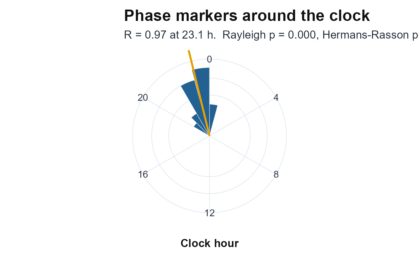
Plots daily phase markers (acrophases, onsets, L5/M10 times) as a rose diagram
around the 24-hour clock, with the mean resultant vector drawn from the centre
and the Rayleigh and Hermans-Rasson results annotated. This is the companion
figure to phase.concentration. Sector area, not radius, encodes
the count (the radius uses a square-root scale) so a wide sector is not read as
a large one. Returns a ggplot object and never errors.
References
Fisher NI (1993). Statistical Analysis of Circular Data. Cambridge University Press. doi:10.1017/CBO9780511564345 .
Landler L, Ruxton GD, Malkemper EP (2019). “The Hermans-Rasson test as a powerful alternative to the Rayleigh test for circular statistics in biology.” BMC Ecology, 19, 30. doi:10.1186/s12898-019-0246-8 .